

Picking the right paint color for your home is exciting, but it can also be tricky. I’ve learned the hard way that some colors, while tempting, can make a room feel anything but inviting. Let me walk you through five paint colors I’d personally avoid ( You should also try to avoid…) and why they might not work for your space.
Paint Colors You Should Avoid in Your Home (and Better Alternatives)
Table of Contents
Peachy Pink

Several years ago, I held the belief that peach walls would impart a retro charm to my dining room. However, this expectation proved to be misguided. The space conveyed a sense of being trapped in a time warp, and despite my efforts to enhance it with plants, artwork, and new furnishings, the issue remained unresolved.
For those who appreciate warm tones, I recommend considering a soft terracotta or blush pink instead. These alternatives are significantly more compatible with modern décor and are likely to yield a more favorable aesthetic outcome.
Greenish-Brown (Opaque Couché)
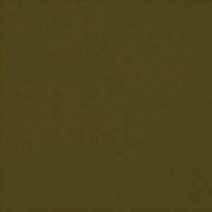
Initially, I didn’t pay much attention to this particular color until I stumbled upon the label “world’s ugliest color.” After seeing it, I can honestly say it deserves that title. The shade is incredibly dull and lifeless, creating an almost oppressive atmosphere when applied to walls. I recall a friend of mine who decided to paint her guest room in a similar hue, thinking it would create a serene, earthy ambiance. Unfortunately, the end result resembled a dimly lit storage closet rather than a welcoming space for guests.
If you’re looking to evoke earthy vibes in your home, I strongly recommend opting for warmer tones such as olive or taupe. These shades manage to feel cozy and inviting without crossing into the realm of dreariness. They bring warmth and character to a room, enhancing the overall feel instead of muting it.
Neon Yellow

When I first moved into my apartment, I painted the walls a bold neon yellow, hoping to create a lively atmosphere. However, it quickly became a mistake, as the harsh color made it impossible to relax.
Now, instead of bright yellow, I choose a soft, buttery shade that brightens the room while promoting a calm vibe. This gentle color pairs beautifully with white trim and light wood accents, transforming my living space into a more inviting and serene retreat.
Bright Orange

Bright colors, such as orange, can significantly impact the atmosphere of a space. For example, a friend of mine opted for a vibrant orange shade in her kitchen, believing it would create a cheerful environment. However, she found the color to be overwhelmingly intense, and it even affected her appetite, as orange is known to stimulate cravings.
For those who enjoy the color orange, a muted rust or burnt sienna might be a better alternative. These shades can provide a pop of color while maintaining a more balanced and inviting ambiance.
Bright Red

Red is often perceived as a bold choice for interior design; however, it may not be the most suitable color for spaces such as living rooms or bedrooms. For instance,
Opting for a bright red accent wall can create an atmosphere that feels intense and potentially stressful. Instead, selecting deeper shades like burgundy or maroon can achieve a more balanced effect. These richer tones offer warmth and elegance while maintaining a calming ambiance, making them a more favorable option for personal spaces.
Advice for Choosing Paint Colors
What I’ve discovered is this: the most delightful paint colors have the power to elevate your mood the moment you step into a room. It’s best to steer clear of hues that come across as overly bold, antiquated, or overwhelmingly intense for the space you’re designing. Instead, embrace the warmth of soft, neutral tones that evoke a sense of calmness, or explore muted versions of your favorite colors that provide a touch of personality without overwhelming the senses. Your home should be a sanctuary—a place that envelops you in comfort and joy, and selecting the right paint color plays a crucial role in crafting that atmosphere.
Have you experimented with any of these soothing colors in your own space? Or do you have a trusted favorite that never fails to inspire? I’d love to hear about your experiences and what colors resonate with you!